For nine years, my work has been guided by a curiosity to understand how design, interaction and motion transform ideas into meaningful experiences.
I’ve learned that creativity is equal parts study and play. Once you know the rules, you can bend them to create something new. I love that space where logic meets emotion and every pixel sparks a new possibility.
When I’m not designing, I’m usually playing guitar, somewhere between a metal riff and a piece of gear I definitely don’t need.
Welcome to my corner of the web, a glimpse into who I am, what I’m building and the ideas still on the way.
Enjoy the ride!
0%
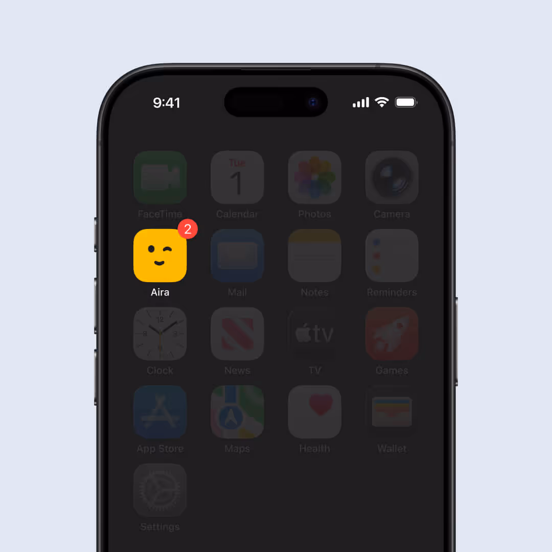
PONDERA
Hello There,

I'm Thiago
cursor
Industry — SaaS AI analytics
uxui / research / product design
2024
Pondera
AI Product Analytics
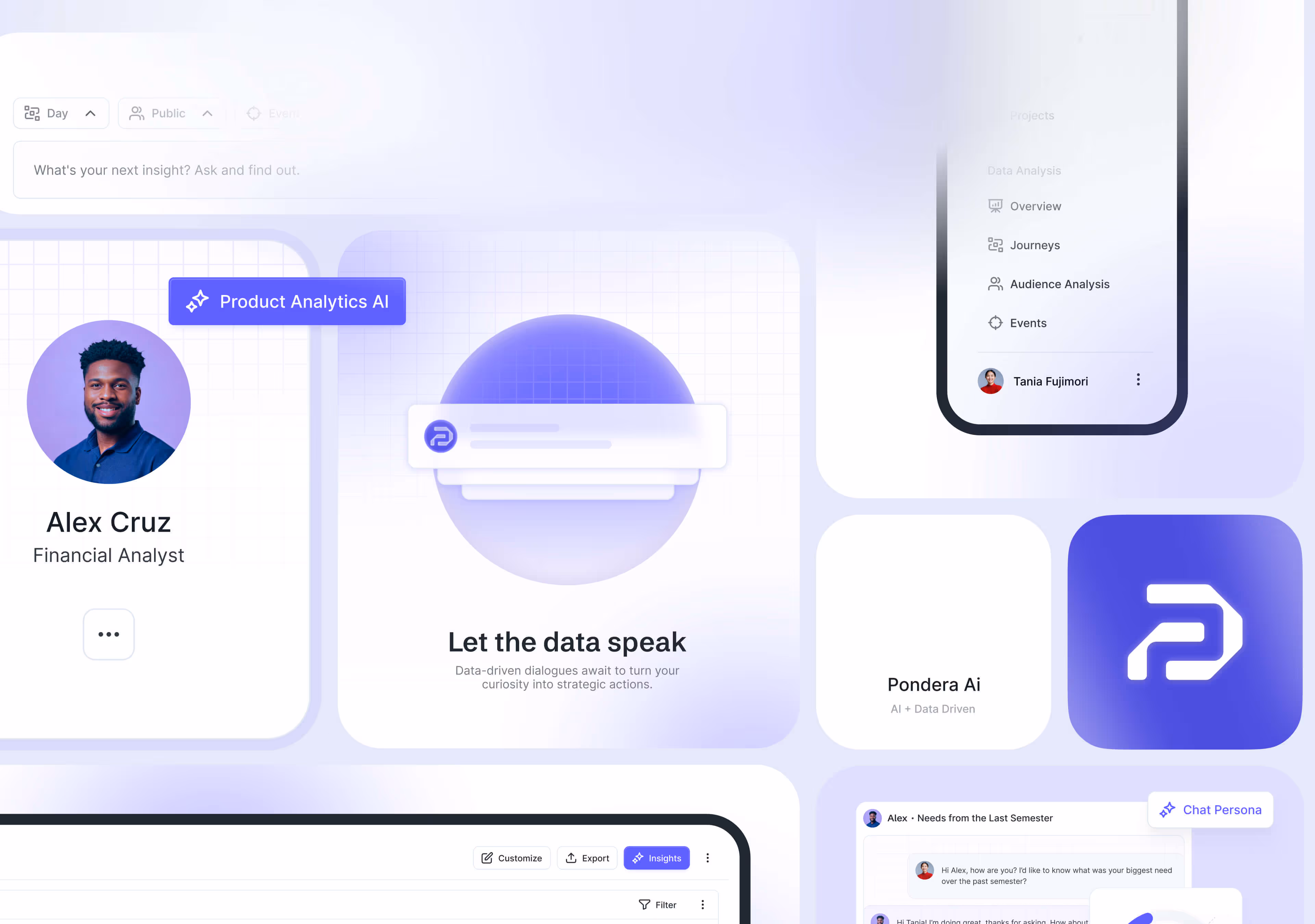
Pondera is an AI product analytics platform that helps teams turn product data into decisions, making advanced analysis accessible for small businesses and busy product and marketing teams.
The challenge
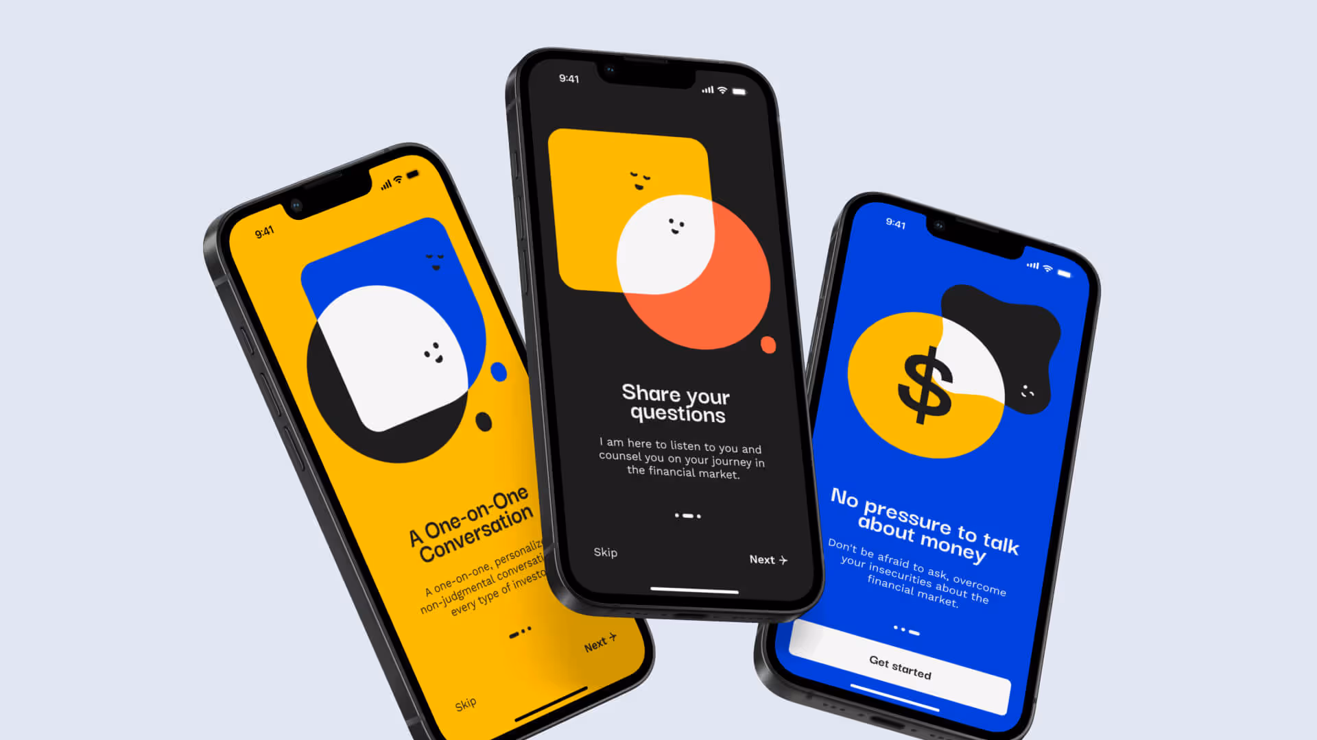
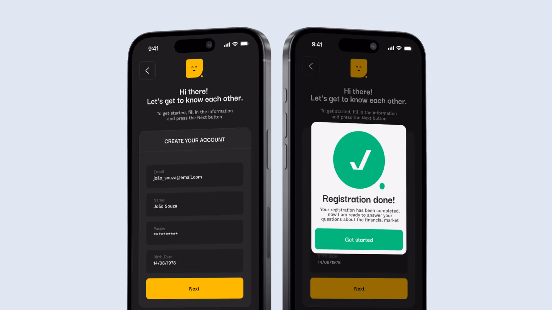
Complex tooling, fragmented workflows, and change resistance made it hard to convert raw analytics into simple actions, so we focused on four solution pillars:
- Accessible intelligence: plain language, guided flows.
- Conversational guidance: answers and next steps in chat.
- Transparency: inspect the data behind each suggestion.
- Focus at a glance: key metrics surfaced in clean dashboard
Discovery
After the discovery process, we found small teams drowning in data, hopping between tools, and waiting too long for trustworthy answers. Our goal was to let a marketer or PM ask a question, get a clear next step, and review the supporting data in one place. This focus on reducing noise, shortening time to insight, and unifying workflows directly shaped the product strategy and design.
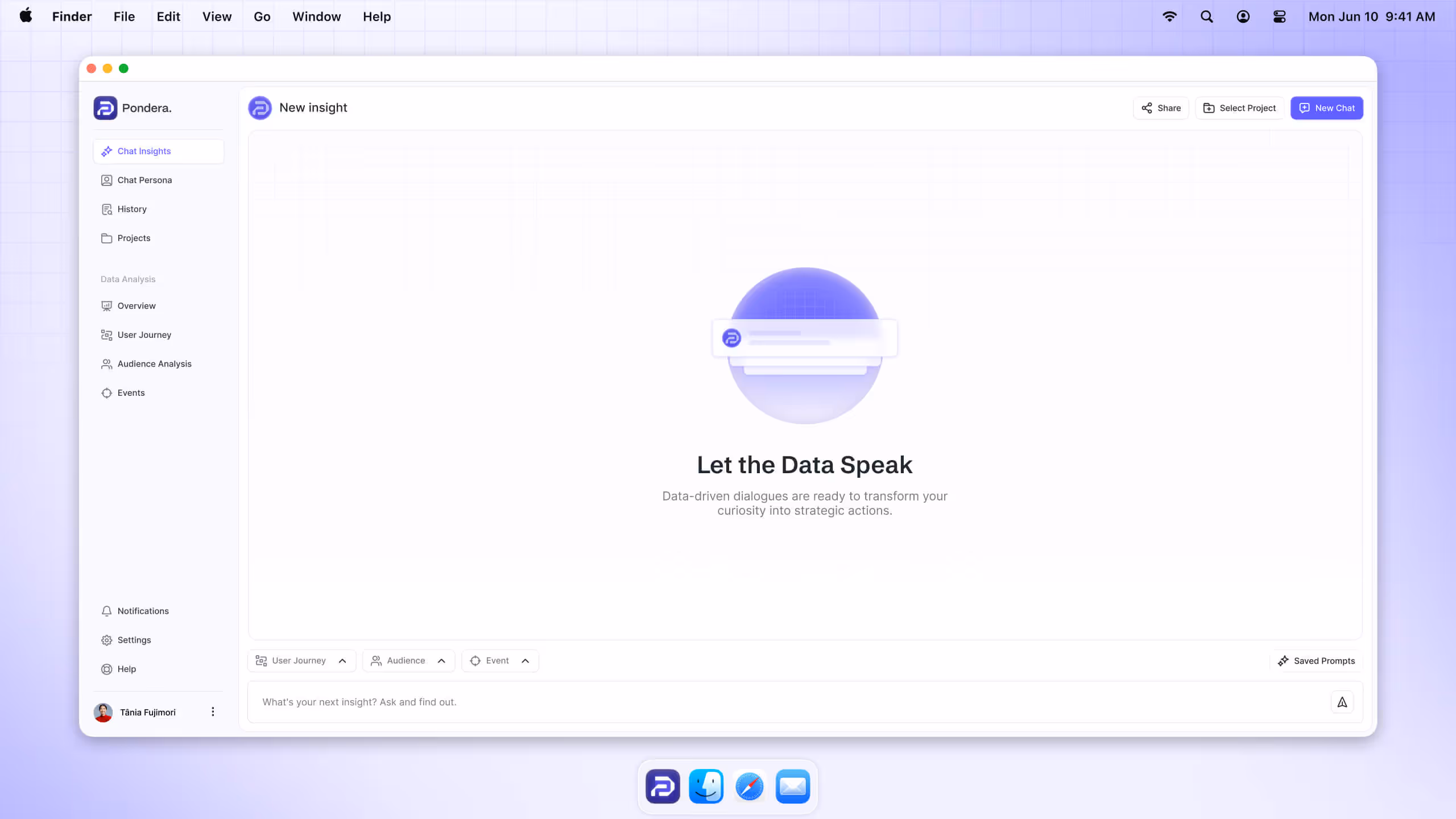
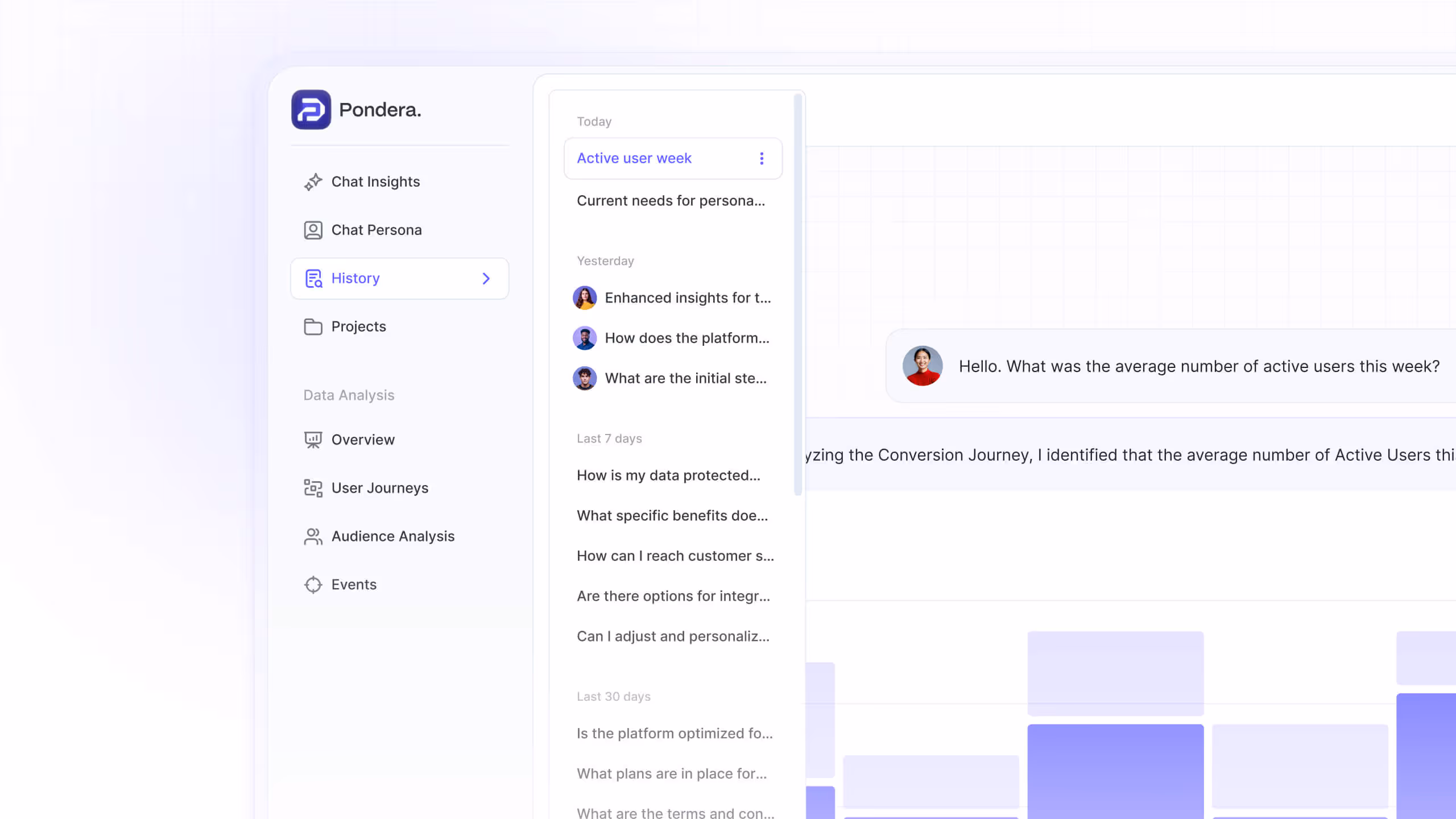
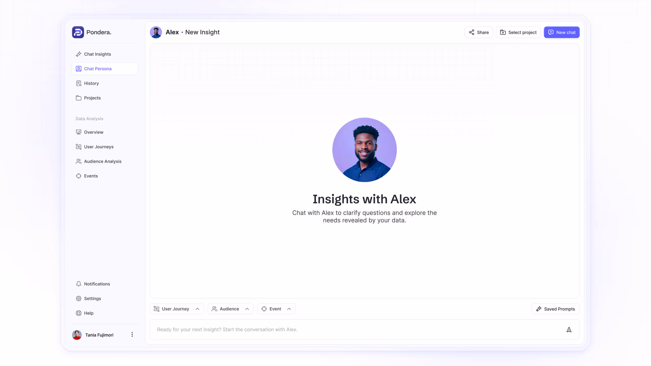
Chat Insights
Teams were losing time jumping across tools to piece together an answer. Insight chat lets a marketer or PM ask a plain-language question and get a clear next step backed by product data. It reduces noise, shortens time to insight, and removes the need to translate analytics into action.

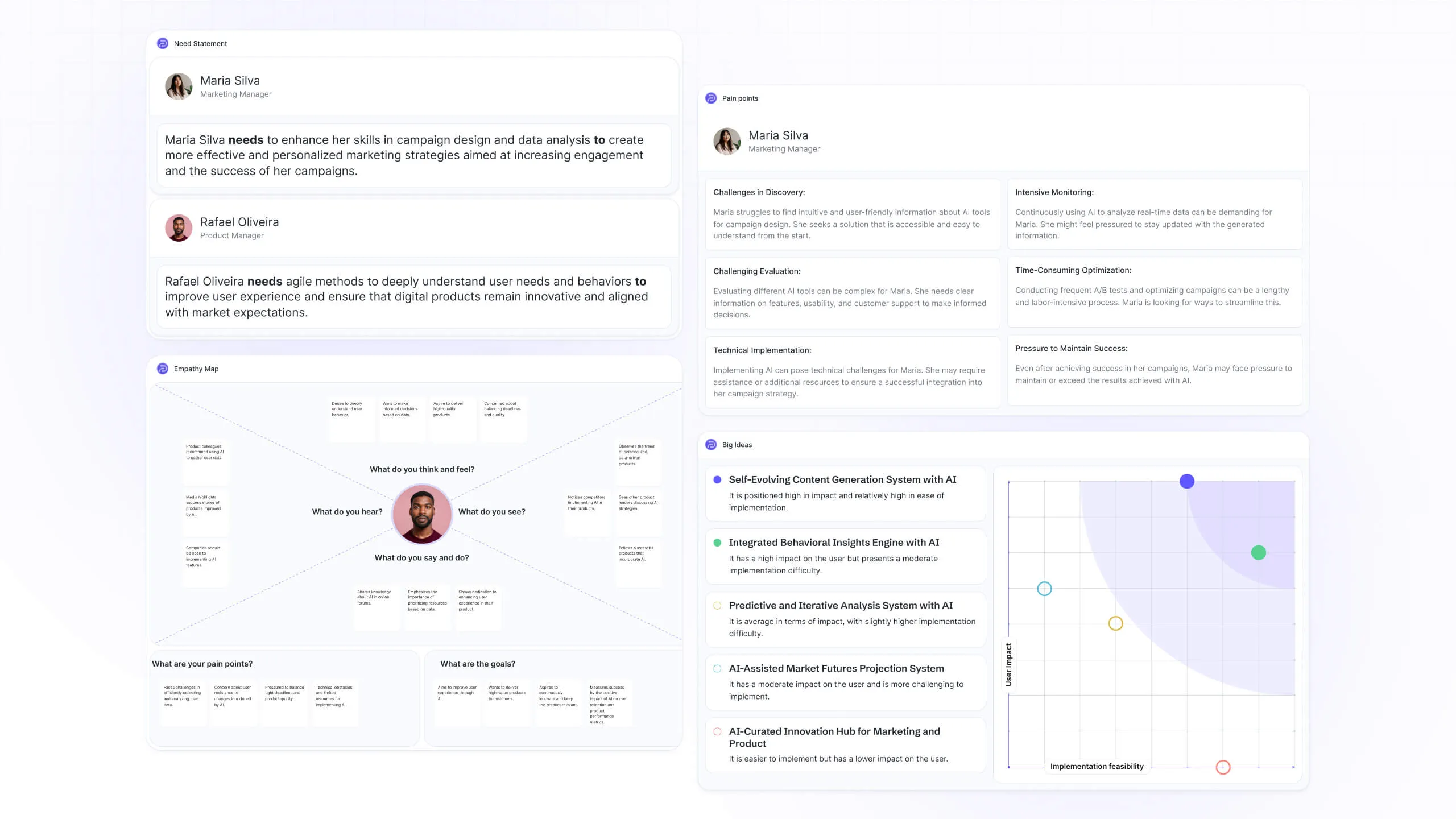
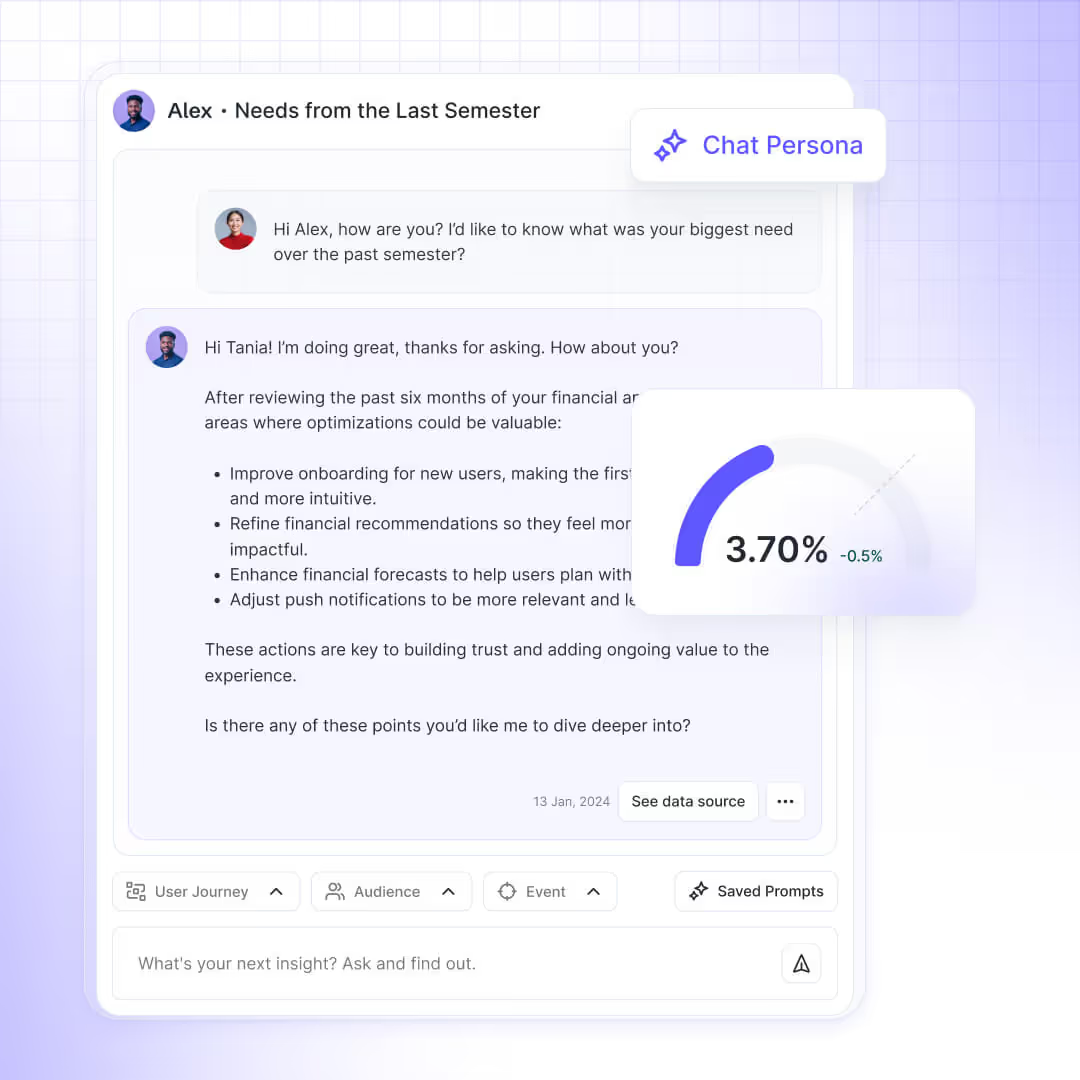
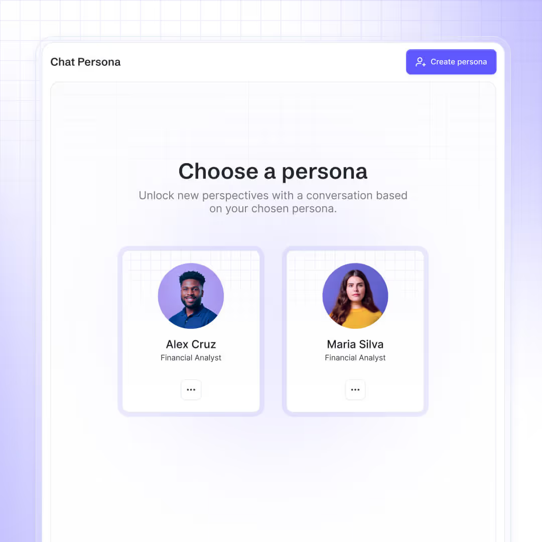
Chat Persona
Patterns in behavior were hard to see without deep analysis. Persona chat uses profiles fed by the product’s own data and inputs on the platform, mirroring real segments so teams can explore who is doing what and why it matters without manual analysis. It keeps exploration grounded in actual users and turns it into a guided conversation that surfaces opportunities faster.
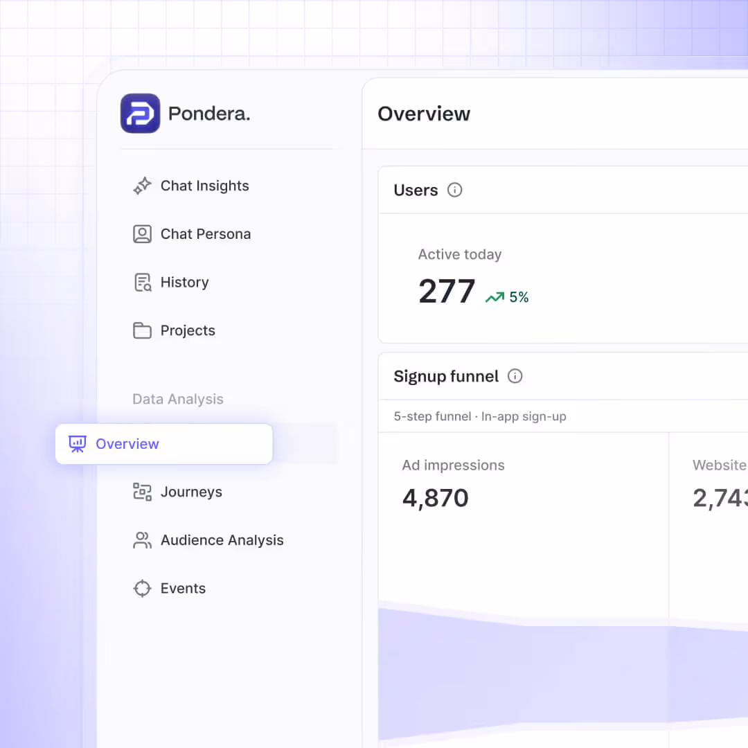
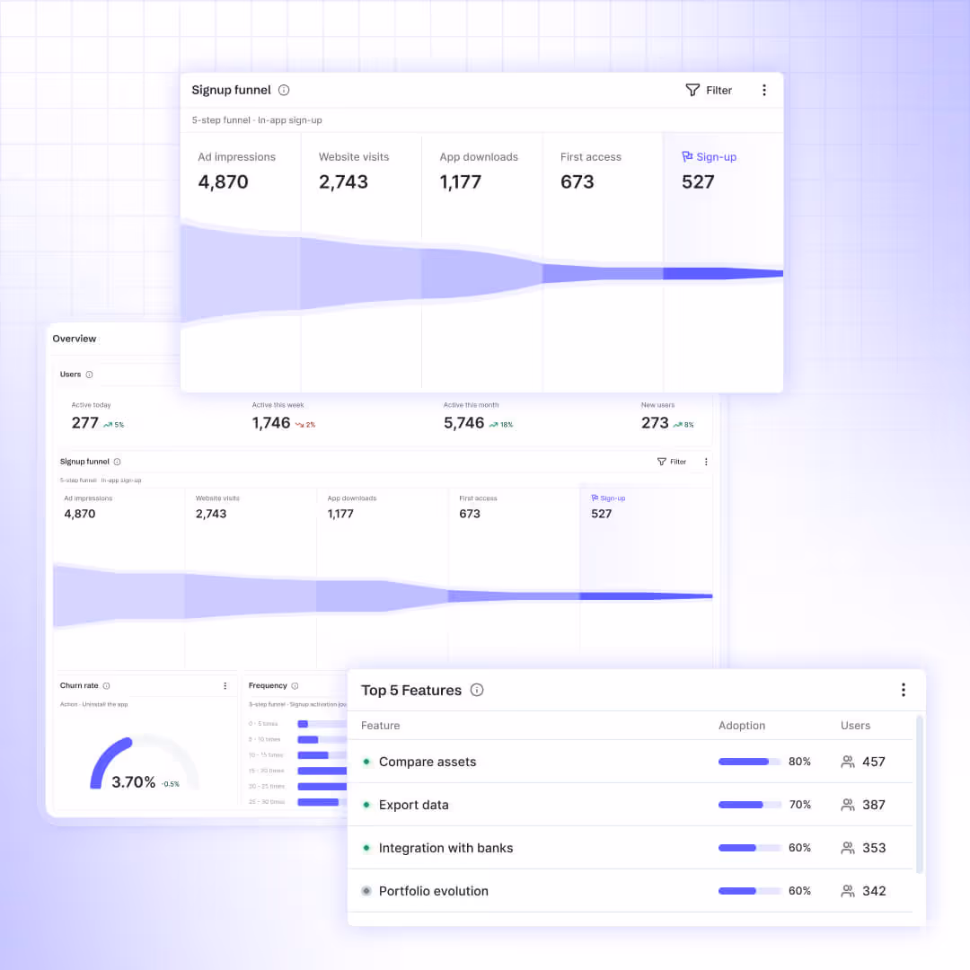
Dashboards
Stakeholders needed a quick read on what changed and what to do next. Dashboards curate only the essential metrics and trends so teams can spot movement at a glance and follow through with the right action. Less scrolling, more clarity.

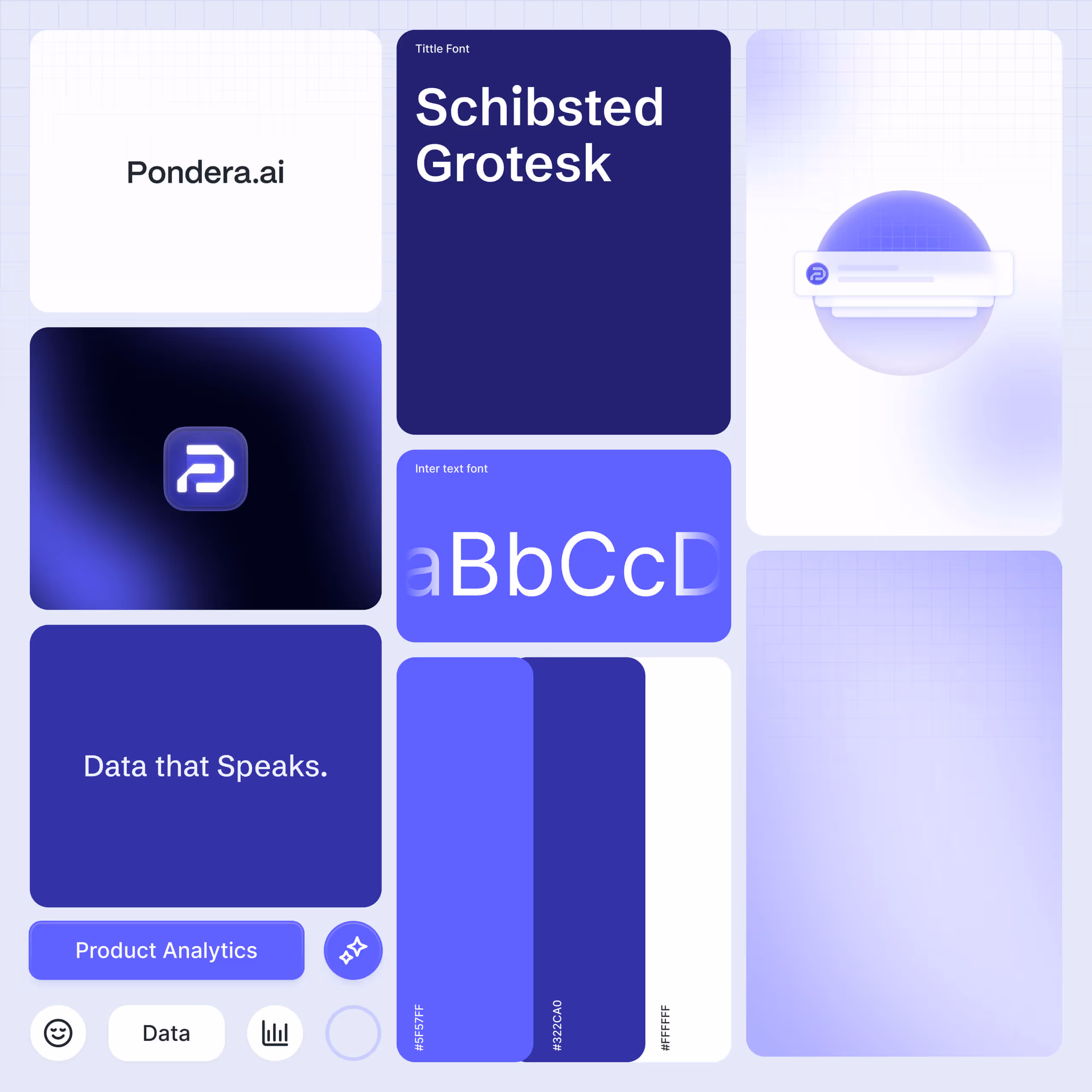
Visual identity foundations
The product needed to feel clear and approachable at every touchpoint. Logo, color, and typography work together to express clarity and accessibility. The visual system keeps screens consistent and readable, lowering cognitive load so users can focus on decisions instead of deciphering the interface.


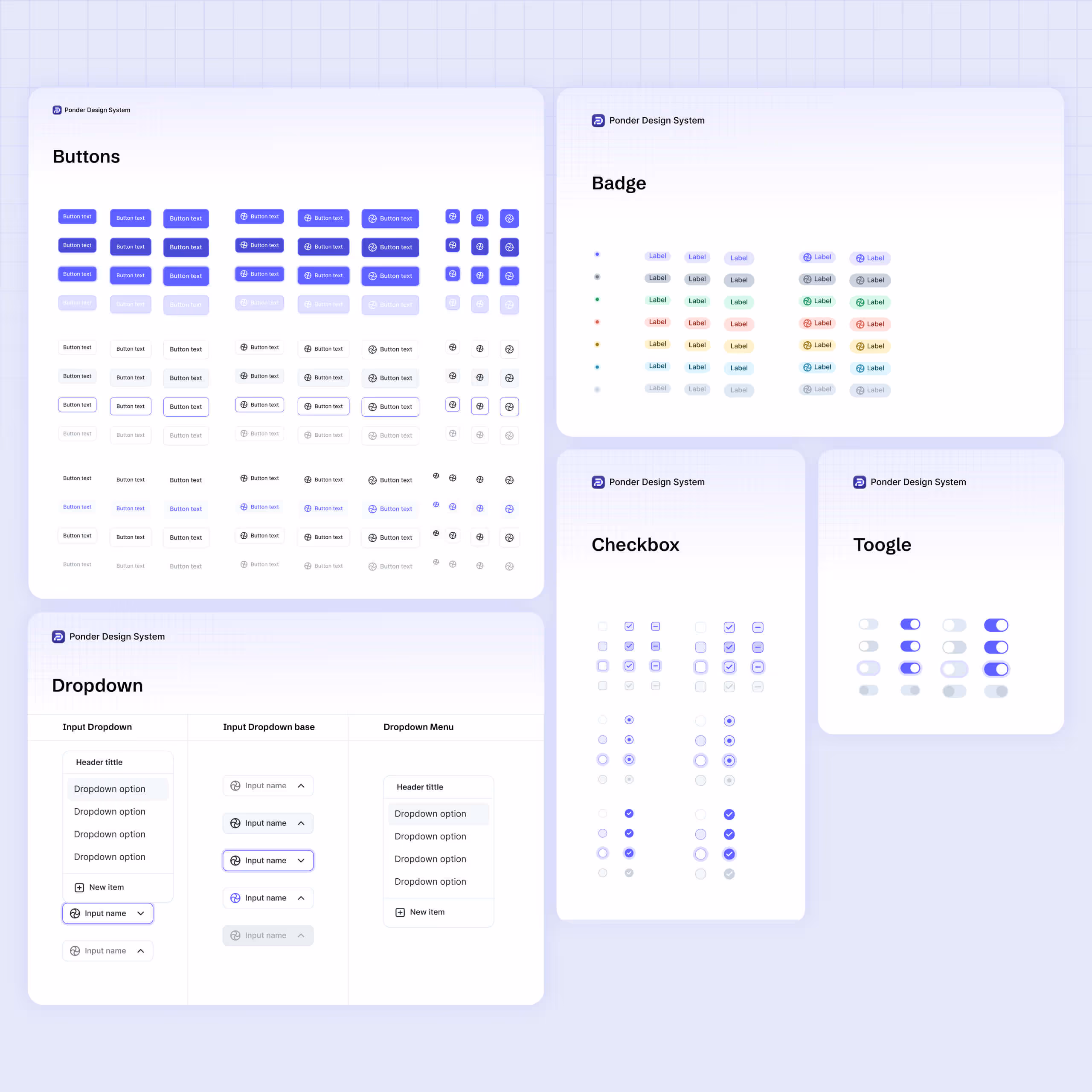
UI Kit
20+ components were crafted to serve real workflows across the product, with tokens for type, color, spacing, and elevation keeping everything consistent from concept to handoff.


Outcome
A cohesive concept and interface that lower the barrier to AI‑driven analysis, helping non‑technical teams move from data to decisions with confidence.